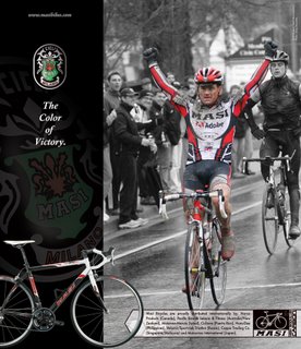
Latest Masi magazine ad.
Since we are already on the topic of good magazine ads, I thought I would share the latest Masi ad, as seen in the current issue of ROAD magazine.
 I don't know about you, but I really love this ad. Just to clarify- I still love my domestic team (Abercrombie & Fitch/ Inferno), but this photo was just too good to pass up. The rider is on the team we sponsor in Canada (Masi-Adobe), via our distributor there- Norco. The rider is Scott Goguen and the photo was taken by Greg Descantes- an amazingly good photo at that.
I have to give the bulk of the credit for this amazing ad to Rick Ortiz. Rick is one of our Graphic Gods at work. He and I worked on this ad for a long time to get it where we wanted it and I am really happy with the final product. In previous discussions about Masi ads, I've mentioned the difficulty in coming up with something that you really feel good about, when trying to create an ad. This one is a homerun though. I love this ad and I am excited that Rick and I are working together to create the next Masi catalog as well. This ad is a sign of good things to come...
Tim Jackson/ Chief Kool-Aid Dispenser
Posted by Tim Jackson at 9:21 PM
![]()
![]()

9 Comments
I don't own a Masi, but I agree, that's a sweet ad.
You folks done good:-)
Just subscribed to Road Magazine after buying one at the grocery store this week. The ad is really nice.
On the subject of your team.. I don't understand why the A&F team doesn't use their sponsor company for jersey design. Seems like a lot of potential for sales to the public, if they'd use one of their classic logos as a base for the jersey design (ie: http://www.abercrombie.com/webapp/wcs/stores/servlet/product_10051_10901_266022_-1_12215 ). Now that casual cyclists don't have a Lance jersey to buy, something like this might fill the void. Not for everyone, but I think it would sell.
George- Many thanks friend. We're pretty proud of it. Creating ads that appeal to the public is really hard, but creating one that you are totally happy with and anxious for people to see is even harder.
marvink- You have a good point and I wouldn't be surprised if the clothing design changes for next year when the team is granted full pro status. I like the design and wear the team kit with pride when I ride with it on, but I think that A&F could use it more effectively to market themselves. Here's my theory- and it is totally unproven and based on personal speculation; I believe that A&F had a "hands off" role with the team this year as they watched to see what developed. However, with the success the team has had and the interest that has developed around it, I predict that they will have a much greater role in things next year, including design and marketing of the team's clothing.
nice ad from a traditional meesage delivery.
but i thought the colour of victory was yellow? *wink*
the new Masi ad definitely has a timeless classy design sense that clearly shows the product. smart and well done.
Heyyyy, wait just a gol-darn minute. The bike being ridden in the ad has totally different paint job thatn the "stock" Masi pictured in the corner.
Busted, Jackson!
And if the frames aren't the same then what else has been swapped out? Is that even a real picture? Nice effect having a full color rider and B&W background, sure it's not superimposed?!?
- A concerned cycling consumer.
to anon @ 502am... hahahaha rofl. you got him. great point though.
Finally somebody caught that! Kudos to "anonymous" (as if...).
I was waiting for somebody to notice; see, everybody is a target, including me. FSA isn't the only one to fall victim.
For the record, the fork and frame do not match because we didn't have a frame in Scot Goguen's size in the model color needed. I saw the photo and debated using it because of the mis-match, but in the end it was just too good of a photo and Rick did a super job creating the image that you see. Is it perfect? No.
Isn't this fun? More discussion class... talk amongst yourselves.
Where can I buy the Jersey the guy in the ad is wearing? Thanks.
Post a Comment
« Home