The first new Masi ad in two years.
 So here's the first ad we've done in a few years and the first ad for Masi that I am responsible for.
Well, go ahead and say that you absolutely love it and are so moved by the dramatic elegance that you are heading to your local shop to purchases this beauty.
Ok, I can live with hearing that you don't hate the ad.
Admittedly, it isn't perfect, but it does do a nice job- I think- of highlighting the history of the brand while showcasing a distinctly different product in a very simple and powerful way.
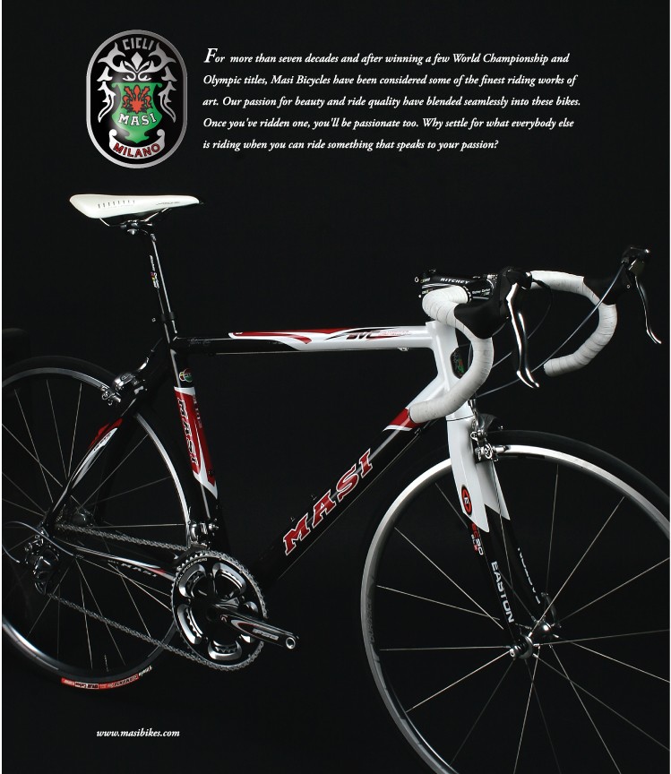
Pete Demos, our Creative Director (and photographer extraordinaire) took the photo of the bike and we used it in an ad in the Show Daily edition of Bicycle Retailer and Industry News (BRaIN) during Interbike. That particular ad just had the photo of the bike and our show booth number. It was very basic, but I felt that the image of the bike was so strong that we could use it again.
The ad, as seen here, is currently in the newest issue of ROAD magazine. Like I said, it isn't perfect, but the point was to do two things; 1) reconnect the brand to its very long and illustrious history and 2) create an air of mystery and intrigue with the dark space around the bike. Since we already had the photo, all I had to do was come up with the text for the ad. I can't honestly say that I felt it was a home run, but it works. The only problem I really have with the ad is that the word "passion" is used three times and that I never caught it during revisions. Don't get me wrong, I wanted to use the word... just not three times. There's making a point and then there's writer's block induced redundancy.
Also, I wasn't sure about the font used in the ad. In the small proof we created, the lettering seemed a little too small and hard to read. I was a little worried about it until the magazine showed up at work. It reads much better when you are holding the magazine.
Overall, I can live with this ad and I have to since it is already in circulation and people are emailing me, telling me they saw the ad. Maybe the next one will be better, since I'll have more time to prepare the ad. At some point during the year, I will be using one or more of the pro teams I am working with for images in the ads I produce. Hopefully they will be winning races so I can use some good podium pictures, but that is still a few months off.
For now, I'm pretty content with this ad. It really looks much better in person since the magazine uses a rather large page format and the ad is full page. I've committed to several more issues, so I have a few more chances to come up with that one great ad that really grabs some attention. Here's to hoping I'm not afflicted with writer's block again on deadline day.
Tim
Posted by Tim Jackson at 12:04 PM
![]()
![]()

5 Comments
Nicely done, Tim.
I absolutely love it and am so moved by the dramatic elegance that I'm heading to my local shop to purchase this beauty.
Just not today. And my local bikes shops (4 of them in my city of 80,000) don't carry Masi.
It looks very classy, just like a Masi ad should.
Here are some comments that were emailed directly to me, out of an attempt of courtesy, but I feel that they are very relevant to this forum, so I am posting them- though keeping the person's identity anonymous out of fairness.
***********************************
Please let me know if my writeing you is a bother. I saw your post about the
new Masi ad. I was going to comment on it, then thought it would be better
to e-mail you directly. I dont want to come off as some know-it-all. But I
at an advertising agency where we are in the business of building brands.
First let me start by saying good job. Really. It's well done. Anything
after this point is nit-picking. Not that it doesn't matter, because every
little thing matters in branding.
Now for my critique. And please dont take this the wrong way. I would remove
the photo of the bike and place the head badge as the focal point of the ad.
Reason? Well your 2 points come to mind. . Connecting with readers, and
creating an aire about the brand. I think readers of ROAD (I assume that
it's a road bike magazine) will know that most advertising in it is going to
relate to bikes. Too many times does a bike company insist on a product
shot. The thing is... while ultimatly you are selling a product, it's the
connection to the brand that drives a consumer to purchase from you.
What I see is just another aluminium and carbon bike. The thing that catches
my eye and draws me is that it's a Masi. Bikes look so similer anyway. It's
not like you could pull the stickers off and people would know it's a Masi.
Cyclist look to the headbadge for identification. So the image of the
headbadge is what connects to the viewer. Not the bike itself. So lose the
pic of the bike and use what the draw is.
You are also right in questioning the font. It seems a little hard to read,
but it seems to work. I would have chosen a different one, but that's just
me.
Again, I don't want to seem like a know-it-all, and I don't want you to
think the ad sucks, I just think it could do a better job of building the
Masi brand image.
Mahalo,
I understand the point that the person critiquing the ad was trying to make, but I disagree about the need for a product shot in this ad. When I think of Masi, I still picture the Gran Criteriums that I loved in the 80s. The headtube badge shown in the ad serves as a reminder of the brand’s history, and I agree that is a good thing, but the bike illustrates the rebirth of this great old brand. It is also true as the person points out that I would not recognize the bike pictured without the stickers. So what? I would still recognize it as a nice modern compact frame with an integrated headset. It looks like a bike that I would race today, not just one that I remember fondly from 20 years ago. Without the product shot, I don’t think people would make that connection between the brand’s history and the new bikes that will shape the brand in the future.
Post a Comment
« Home